Kuja

Prusa

Visual identity concept for Prusa3D, developed as a finalist entry in an internal competition the company ran with our studio for a new brand identity. Nothing won in the end.

Prusa isn't one product, it's an ecosystem: hardware, a slicer, an online 3D printing platform, a materials lab, each running as its own semi-independent sub-brand. The goal was to bring all of it under one coherent visual story.

Each sub-brand gets its own simple geometric mark so the whole ecosystem reads as one family rather than four separate logos.

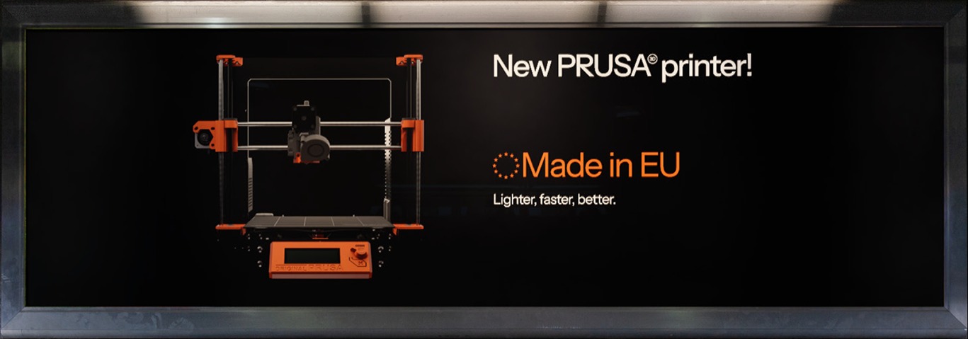
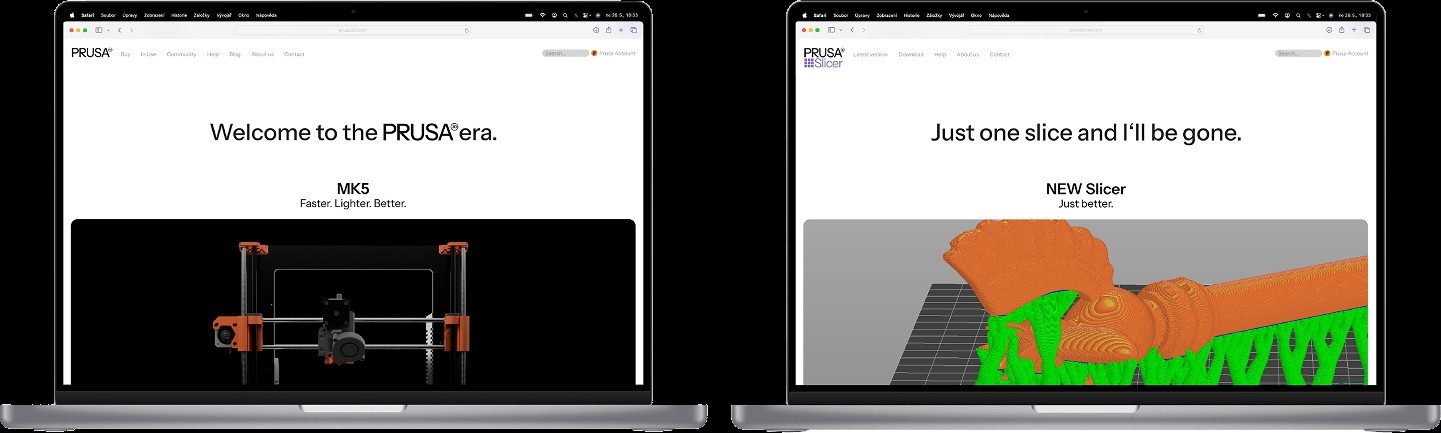
The PRUSA3D wordmark, on light gray A row of five geometric marks: triangle, circle, three dots, gear and grid, on light gray Six PRUSA3D sub-brand lockups, each with its own colored geometric mark: Polymer, Academy, Slicer, Lab and Connect, on light gray Three sub-brand logos on black: PRUSA Solid, PRUSA Trilab and PRUSA Printables, each with its own colored geometric mark A wall-mounted monitor ad reading 'New PRUSA printer! Made in EU. Lighter, faster, better.' beside a render of the printer Product names CW1S, MK3 and SL1S Speed, each marked 'Made in EU' Two laptops side by side: one announcing 'Welcome to the PRUSA era, MK5' with a printer render, the other showing the new Slicer's 3D print preview in orange and green

The ornament system works differently: shapes pulled straight from the printer's own components, gears, brackets, nozzles, mixed and recombined into patterns, tying the physical product back into everything built around it.
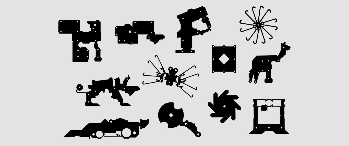
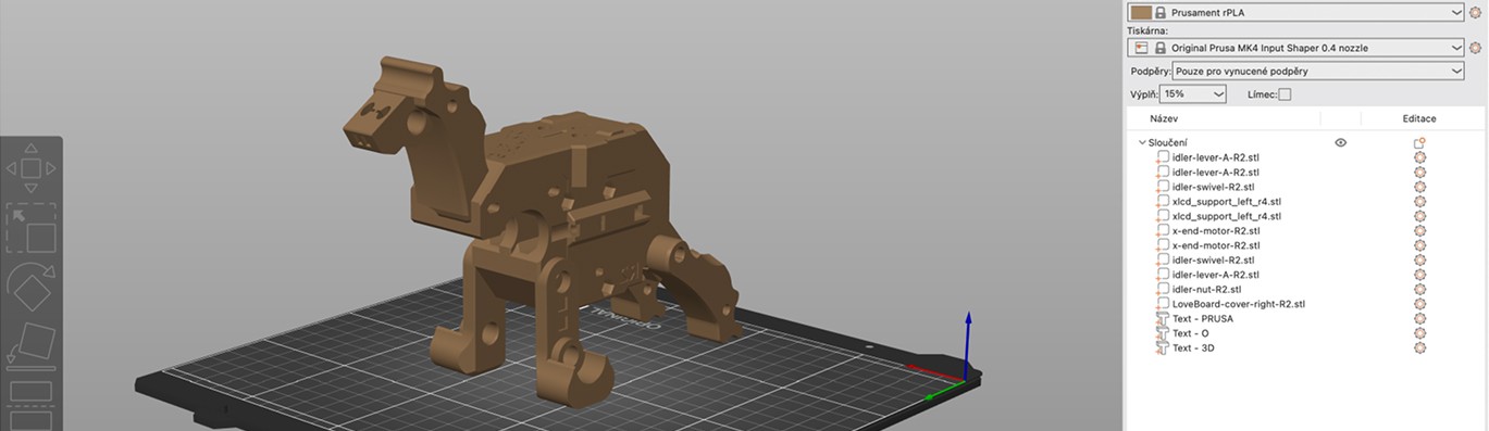
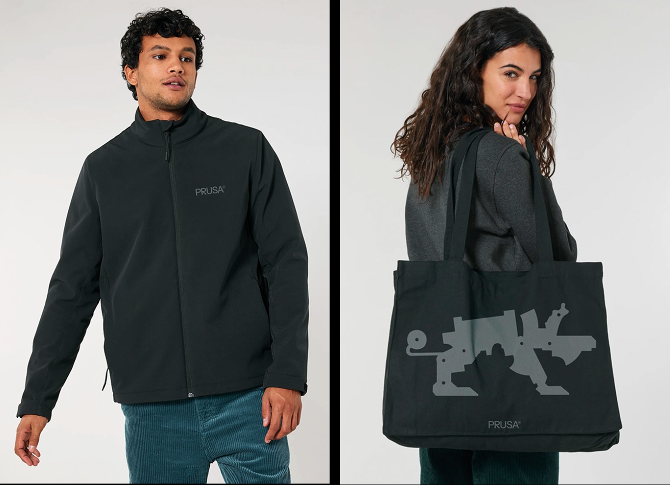
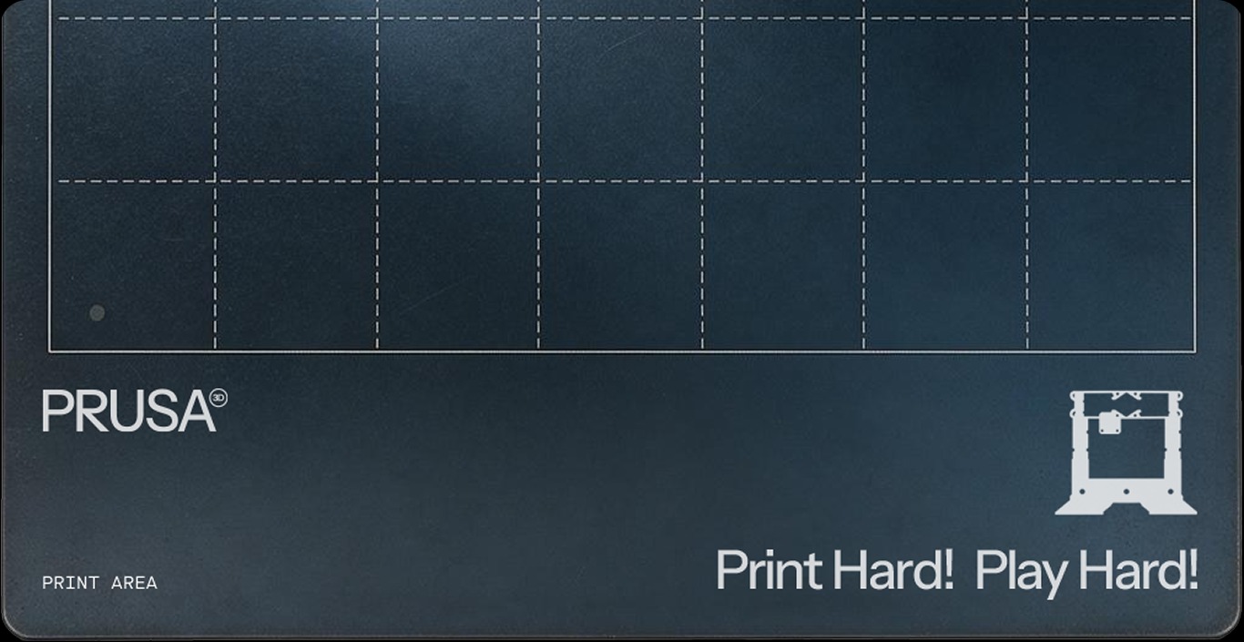
A grid of black silhouette ornaments built from printer parts, recombined into shapes like a camel, a spider and a fan, on light gray A 3D-printed camel figurine on a print bed, shown beside a slicer software interface listing its component parts A man wearing a black PRUSA-branded softshell jacket beside a woman carrying a black PRUSA tote bag printed with a gray mechanical creature silhouette A dark blue PRUSA print-bed-styled card reading 'Print Hard! Play Hard!' with the PRUSA logo and printer icon