Kuja

Srdcem Robinson

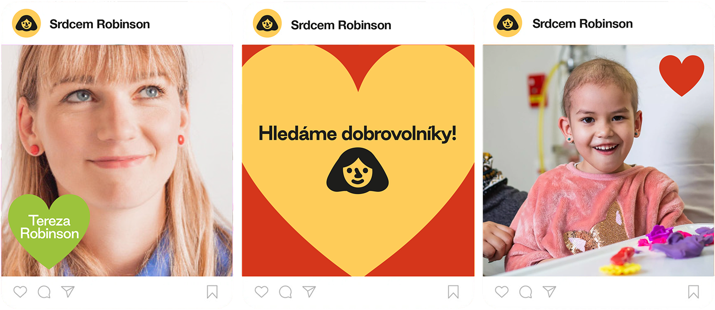
Visual identity for Srdcem Robinson, the first organisation in Czechia offering coaching and therapy to entire families living with a seriously ill child, and to the healthcare workers who care for them.

The identity centres on one mark: a heart, standing in for the organisation's name and for its whole approach, care as strength rather than softness.
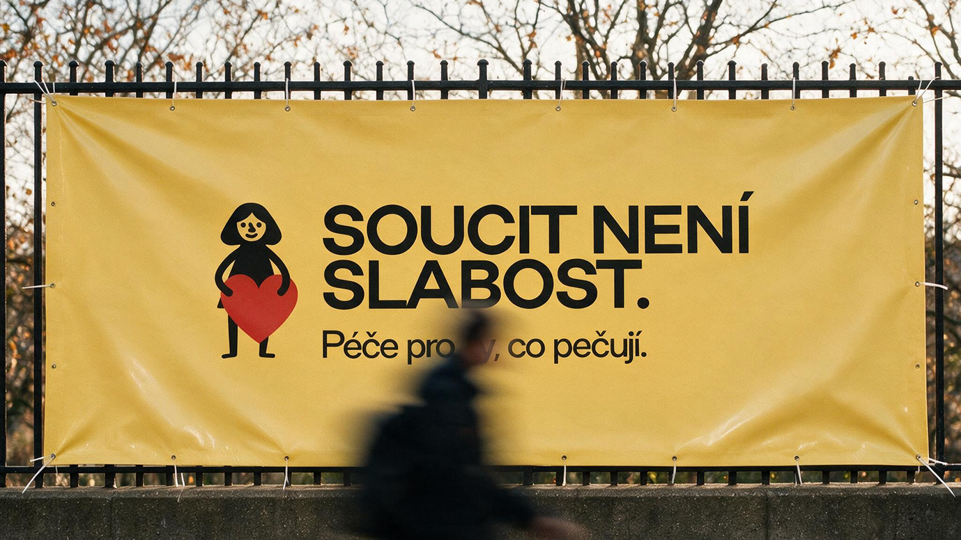
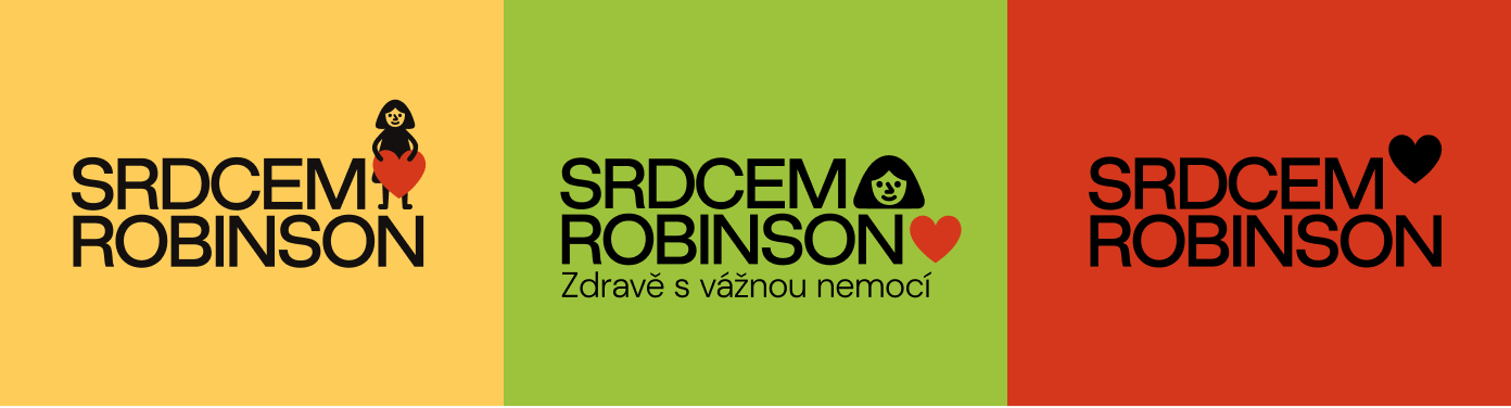
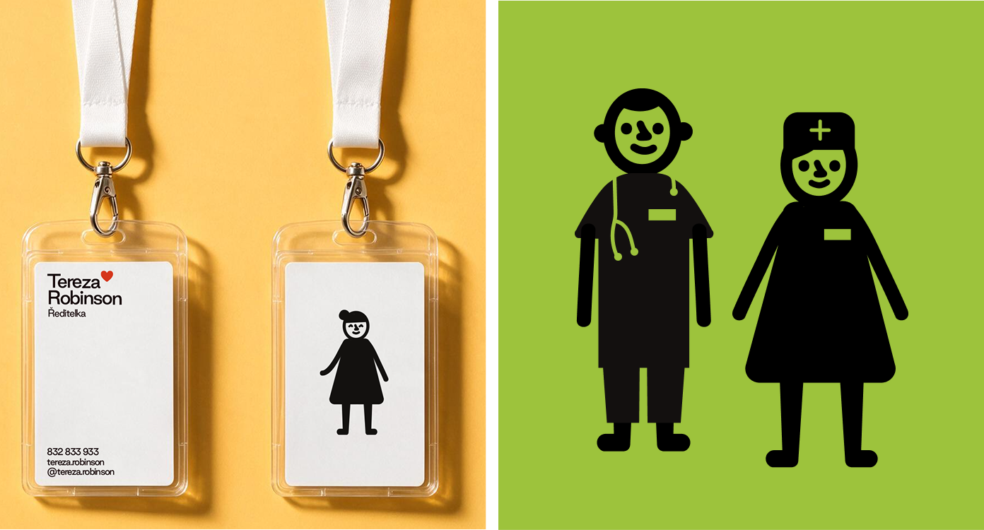
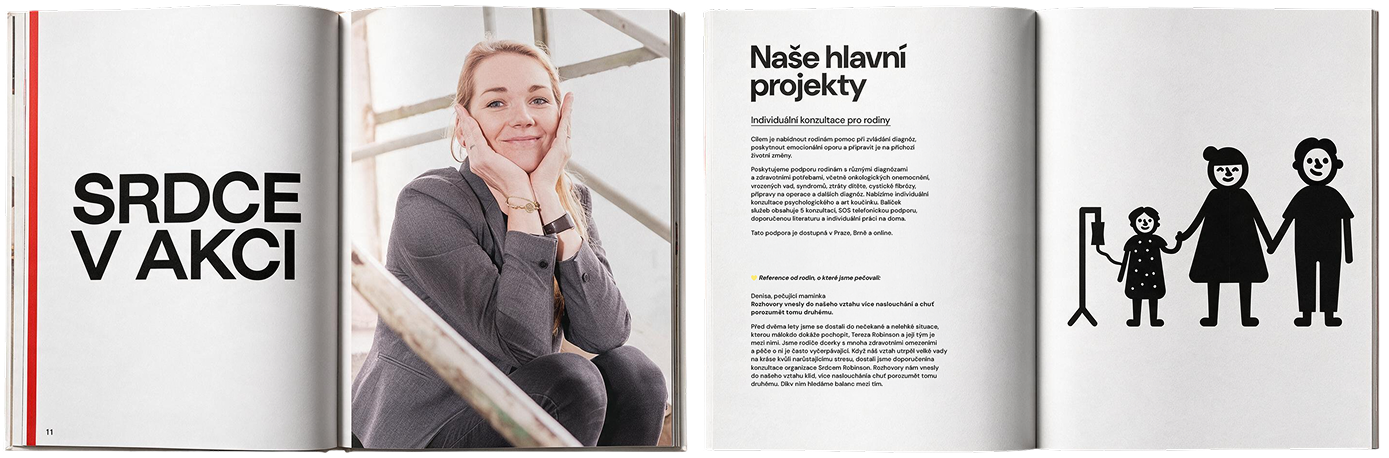
A yellow fence banner reading 'Soucit není slabost' (Compassion is not weakness) with the Srdcem Robinson logo Three logo lockup variants for Srdcem Robinson on yellow, green and red backgrounds Black pictograms of a parent and child holding hands, on a green background A lanyard ID badge reading 'Tereza Robinson, Ředitelka' beside a black pictogram of a healthcare worker and a nurse on green An open book spread titled 'Srdce v akci' with a portrait photo, followed by a second spread listing the organisation's main projects beside a pictogram of a family holding hands

It's a brand built to feel human first: warm, direct, and unafraid of being gentle in a space usually treated with clinical distance.
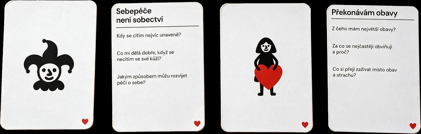
A white t-shirt printed with the Srdcem Robinson logo, laid on a yellow background Four white conversation cards from a Srdcem Robinson card deck, illustrated with a jester and a heart-holding figure, with prompts like 'Self-care is not selfishness' and 'Overcoming fears'